Blog
Loading images is a significant factor in performance of web sites. You have 4 ways of loading images on your site:
- Load everything on page load (the default option). This is what happens if you don't do any optimization and it results in bad performance if you have images below the fold.
- Load images inline. This is usually not an option, unless you have just one or two ideally small SVG images.
- Lazy load images. Using either the browser lazy load function or a JS implementation, you can have your images loaded when they're about to be seen. In most implementations, the image will just pop in when it loads.
- Show a low quality placeholder (LQIP) while you're lazy loading images. A placeholder is an inline image which would ideally help make the image loading look smoother if user saw the image load.
I will focus here on the placeholder option, as it should provide the best user experience. When implementing placeholder images, the main problem to solve is what the placeholder will look like. There are some great looking options and you can read more about them in this great article written by José M. Pérez. The problem with the triangles approach (which is my favourite) is that it requires a binary to be installed and ran on each image. You could (and should) cache the result, but I wanted a simpler solution that would be easier for most sites to implement.
Starting point
I chose one of my photos to use for development because its features can be seen in a blurred image and it has high enough contrast to not look like a blurry mess when blurred. The image was scaled down to 16x9 pixels and I used that as a placeholder.
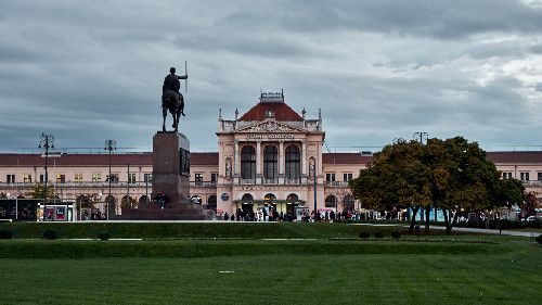

Just use a tiny image
The first thing I tried was to just load the tiny image without explicitly applying any kind of processing. Unfortunately, this is what I got:
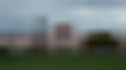
The browser tries to upscale the tiny image with as much detail as possible and the result is the opposite of what I wanted. My next move was to add style="filter: blur(10px)" to the image, but that didn't work out as I expected either:
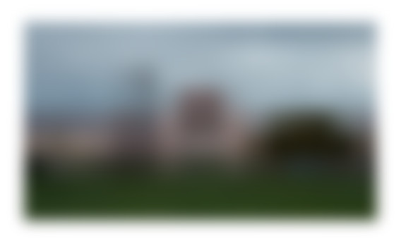
The blur filter expands outside of the image and makes a general mess of things. I wanted to contain the image and have a nice clean edge that looks closer to the original image. My solution was to create an inline SVG image and blur the contents:
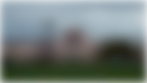
As you can see, this one is also not exactly what I wanted. It uses the background color to blur the inside edges of the image. In the example above, the page background was white, so that's why the edges have a white glow.
Possible solutions
I was determined to figure out a solution that works, so what I came up with seemed kind of dumb, but it makes sense. Instead of having a white background around the image, I would put the same colors as the edge of the image in the SVG, but outside of the viewbox. That way, blurring wouldn't use the background color for blurring and it should look good. To achieve this, I came up with 2 solutions.
Solution #1: Outline
I decided to create a placeholder image that had its borders copied outside into an outline. Using GIMP, I just copied the border pixels 1px outside and used that as my placeholder:

I could then show the initial pixels of the image, but the blur filter should all of them into account. This was my first success!

Here's what the SVG I generated looks like:
<svg viewBox="0 0 16 9" width="1080" height="608" style="width: 100%;height: auto">
    <filter id="b1">
        <feGaussianBlur in="SourceGraphic" stdDeviation="0.5"/>
    </filter>

    <image width="18" height="11" x="-1" y="-1" filter="url(#b1)" href="data:image/png;base64,iVBORw0KGgoAAAANSUhEUgAAABIAAAALCAYAAAByF90EAAAACXBIWXMAAA7EAAAOxAGVKw4bAAABu0lEQVQoz62SuW5TURRF17n3vsF2CINkYwUUKQUSDVIEEunoKPN1fAAdHRUFLXQgMSRNOhABJVGUiSTPfr7TOxTP/EFOv5e0z17y6s07BbDGYoxQFA7nHNYYUs6EmIgp4X3AWEPbLhAR+oxQVyUAhhs6530AoKpK6qoGEawRQDFGGFQFK8OKW6Mxw0FNTJk2BFBlVJdUhetBi5AA8DEzaz11VTJvrvh7csyTp8+wRvAh0jFnvljgnENVqauSEBPDquhBsxABUFW6TilDIs5bFlk5+PObo08fiMHz+OU2q5Mp6hMhJaoyEmLk9KrpQQe7X3pQTgwGQ8rCcn1ySFRhLa1zenGOsZb4a4+f+z/4vvORk8N95t6z9WKbe6uTHjQ2lwC0sWFtNKVtE8eX56DK9fmA8f0xZVkyuzzj685nvu3t4oyQVXj/9jVbm88BkMnDiQI82tjAOaVp5syuG4qy4MF0ysWsAcncXbnD2dkpbevJ9W3wLVY7hqPVHrS+Odb/ExaFw1oDZIzpzRBjEBFSyhjR5T+h6wAxGGxfbbhS9QERrF2KZu1SOiGmjAhURR/QrkM1L8fpUI03K+Q/e/jNXwXa25MAAAAASUVORK5CYII="/>
</svg>
Since I'm usually working with Symfony and the LiipImagineBundle, I decided to create a filter for the bundle that would add the outline for me. Instead of copying pixels like I did when I created the test image manually, I figured I could just copy the image into the canvas a bunch of times (corners first, then sides, then center) and get the same result:

You can see the whole filter on github.
Solution #2: Duplicate the image in SVG
Having to alter the image seemed too complicated for a bunch of use cases, so I decided to figure out a simpler solution. Instead of altering the image, I would just use the same image in the SVG twice. Once at the normal scale and once scaled up a bit and behind the first one, so that I effectively get a very similar result to the outline. SVG gave me a bit of attitude with this, but I managed to figure out a way to do it. I created a symbol of the image (and gave it a viewbox, this part is critical). Then I created a group which used the symbol twice (at different scales) and applied blur to the group:

As you can see, the result is pretty much the same as the outline version, but without having to process the image in any way other than scaling it. Here's the SVG for this version:
<svg viewBox="0 0 16 9" width="1080" height="608" style="width: 100%;height: auto">
    <filter id="b1">
        <feGaussianBlur in="SourceGraphic" stdDeviation="0.5"/>
    </filter>
    <symbol id="i1" viewBox="0 0 16 9">
        <image href="data:image/png;base64,iVBORw0KGgoAAAANSUhEUgAAABAAAAAJCAYAAAA7KqwyAAAACXBIWXMAAA7EAAAOxAGVKw4bAAABoUlEQVQozy3RuW4UQRRA0fuqqrt6FswizTAyyJIDJBIkCySckRH66/gAMjIiAlLIQGKxE2cgDLItyxu2e6antn4EzAfc5B559eadWmMxRqgqh3MOawy5FGLKpJwJIWKsoeuWiAgA1giNr3EhRLyvaXwDIlgjgGKMMPAV46Hn1mjCcNCQcqGLEVQZNTW+crhlzIRUmHeBxtcs2mv+np7w5OkzrBFCTPQsWCyXOOdQVRpfE1Nm6CvcPCZUlb5X6phJi45lUQ7//Ob40wdSDDx+ucPadIaGTMwZXydiSpxdt7jDvS9oyQwGQ+rKcnN6RFJhPW9wdnmBsZb0a5+fBz/4vvuR06MDFiGw/WKHe2tT3MRc0aWW9dGMrsucXF2AKjcXAyb3J9R1zfzqnK+7n/m2v4czQlHh/dvXbG89R6YPp/pocxPnlLZdML9pqeqKB7MZl/MWpHB3fIfz8zO6LlCa2xA6rPYMR2vIxtZEAarKYa0BCsYYAMQYRIScC0YUAFXoe0AMBosbjj0igrUrX2tX1kLKBRHwlf0f9z2qZTW9RzXxD7jBzVuyaZ2LAAAAAElFTkSuQmCC"/>
    </symbol>

    <g filter="url(#b1)">
        <use width="18" height="11" x="-1" y="-1" href="#i1"/>
        <use href="#i1"/>
    </g>
</svg>
Comparison of solutions
Due to having more XML code in the SVG, the duplicate image version is about 80-90 characters longer without taking the embedded PNG into account. With the PNG, the difference is a bit smaller (50-80 characters) because the PNG is a bit larger. The PNG difference is not huge because the outline compresses well since it shares its color with the neighboring pixel.
I expect the double image version to use a bit more processing power, but I haven't really tested this and it's just an assumption. I don't expect the difference to be noticable.
The double image version is a lot simpler to implement on the backend side. All you need is a scaled down png version of the image and you run it through base64 encoding.
Generating SVGs
You can clearly generate these SVGs in any language, but you can check out these example PHP functions (I modified methods into functions without testing them, but the SVG part is untouched and 100% works).
Additional issues to work around
If you're using symbols, they should have unique IDs. My default solution for now is to use md5 hashes of the images to generate a unique ID for each image, but you can choose other methods. One option would be to just use a number and increment it each time you generate the SVG.
Another issue is matching the SVG size to the original image size so that it aligns perfectly. I used original image dimensions as height and width attributes of the SVG to control its aspect ratio.
Conclusion
Going forward, I will most likely be using the double image version since it's a bit simpler. I will, however, keep my filter in case there is a ton of images on a page and those 50-80 characters and performance hits per placeholder start adding up.